


Data is the backbone of any successful organization. It speaks volumes. It can be used to validate the truth, which builds not only trust but also helps convert customers.
A well-placed statistic hits home like nothing else because it's easy for people to digest on impulse. It helps build relationships, which is important for anything you need in business.
That said, data can be overwhelming to consume. You’ve to present it the right way for the audience to receive the message.
A great way to solve this issue is by designing infographics that help explain complicated data in a simple way. They are the best visual tools to convey a data-driven story.
But a good infographic has to be simple and comprehensive for readers, more so than just being attractive.
On that note, here are the 8 best data-driven infographics we could find for you as inspiration.
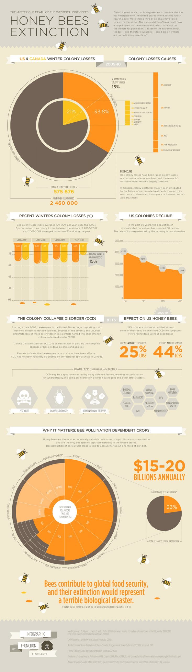
- In 2005, North American beekeepers noticed a sharp decline in their colonies. Every winter since then, beekeepers lost nearly 30% of their colonies.
FFunction made this infographic to help understand the importance of the problem and its effects on our food supply.
We love this infographic because not only does it present data very effectively, but it is also very attention grabbing. Perfect combination of informative and persuasive. The bee-themed vectors and color coordinated palette add to its visual appeal.

- All of us know about the infamous TV series, Game of Thrones. Most of us have watched it and loved the series.
But the creative team at Venngage went a step ahead and made infographics from the show. The one you see below is on the number of betrayals in the series.
We love how simple and effective the infographic is. The team has used bars to indicate the perpetrator vs. betrayal percentage of every character. It makes it so simple to grasp the information. With just a few colors and shapes, it’s not overwhelming to consume.

Here’s more work by the team for Game of Thrones.
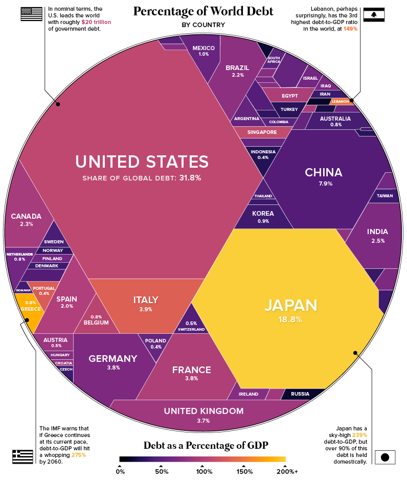
- The next one is by Visual Capitalist, published in an article about the Global Economy.
With just a few colors and geometric shapes, this clever graphic illustrates the world’s largest economies by their share of global debt.
The world would look very different if it were based on financial interests instead of geographic location, as illustrated in this simple but clever graphic. Annotations also call out interesting facts about different countries on the graph.

- Another interesting infographic that caught our attention is by the ACI (Airports Council International).
In 2019, ACI published the World Airport Traffic Forecasts. As you may guess, it came with tonnes of information in forms of numbers and stats. To make it digestible, the information was converted into infographics.
The infographic you see below may look overwhelming, but has a great deal of information that has been made very simple to understand. What we love is that the information is clearly organized and follows a sequential story.

- The Gates Letter (now The Gates Notes), a blog by Bill Gates published an article on Sustainable Development Goals 2030 with a great infographic.
This huge infographic contains loads of data divided into sizable chunks that makes it easy to grasp.
It adopts a bold, thematically appropriate color scheme and features eye-catching graphics. It also mentions the sources of information for the reader. And it tells an interesting, sequential story that sticks!

- The next infographic we want to highlight is one created by Scalenut to showcase trends in Global Retail Sales.
This simple yet clever infographic conveys a lot of information in a few shapes and colors. It is well designed, tells a good story, and also is easy to understand.
The sources of information are mentioned for the reader, making it more authentic. The numbers to focus on have been put in bold to ensure that the reader pays attention to them.

- Another compelling data-driven infographic is by Visual Capitalist.
This infographic using data from the OECD anticipates when countries will economically recover from the global pandemic, based on getting back to pre-pandemic levels of GDP per capita.
Clearly, it showcases tonnes of information in a very precise and intuitive way. The information is clearly organized. On the top right, you can also see which symbol is used for emerging economies vs for advanced economies. It also mentions the source of information, that is OECD.

- This beautiful infographic by Visual.ly (for Udemy) explains a concept by Malcolm Gladwell - that it takes 10,000 hours to really become an expert.
It has all the elements of a good infographic - a compelling story, lots of information, eye-catching graphics, descriptive title and subheads, and clear organization.
With all the sources mentioned at the bottom, it really makes point and proves that you need 10,000 hours to “really” become an expert in any field.

From Visually.
Are you REALLY an Expert? | Visual.ly
These are some of our favorite infographic picks that tell a compelling story driven by data.
What really makes a good infographic?
Looking at these various examples, you might be wondering what works for an infographic? Here are the elements of a good infographic.

Takeaway
Converting data into infographics is the best way to present a data-driven story that sticks with the audience. We hope you found our 10 infographic picks insightful. Curious to know, what caught your eye?
If you are inspired to create infographics for your business, drop a comment below and we will reach out to you.


.webp)


